Remesh
Many People, One Voice.
Remesh allows market researchers to find the consensus of a large group of audiences, using AI to analyze and organize their responses in a real-time conversation interface.
I was their first design contractor tasked with creating the foundation of their user experience.
Challenges
- Surveys are slow and not qualitative, while focus groups aren’t scalable nor quantitative.
Solutions
- To use machine learning to understand and engage groups of people with real-time conversation.
Users
- Decision makers and market researchers who need to understand the accurate and nuanced feedback of a large group in real time
- Audiences who want their voices to be heard by decision makers
Results
- The team built their beta product and landed their first contract soon afterwards.
Step 1
Identifying the Scenario
The Remesh team had built a technology and prototype to statistically deduce a response from a large group through rapid rounds of voting of the group's answers over the course of a few minutes. The prototype earned them a spot at Barclays Accelerator.
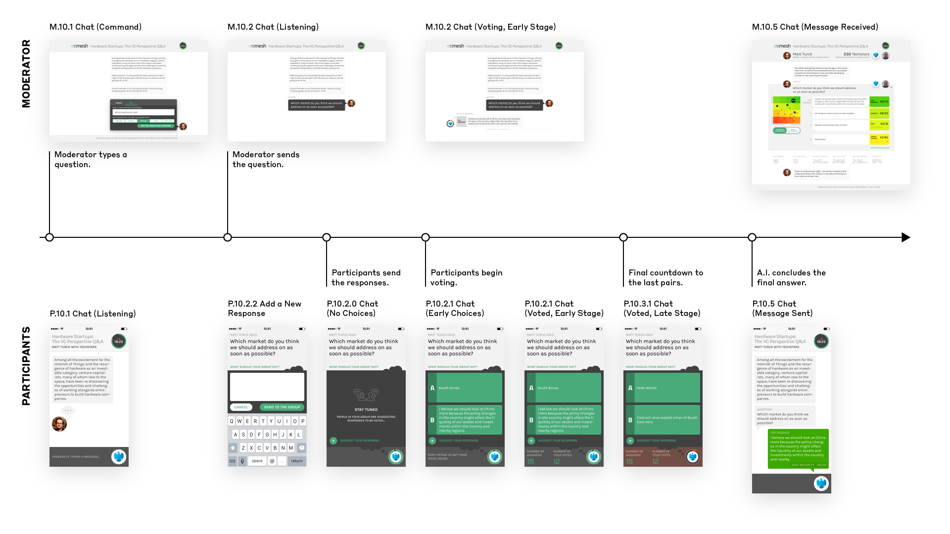
The Core Workflow
There are a few workflows for scheduling and managing sessions designed, but for simplicity here I will present mainly the core workflow: The "conversations" where answers were sought.
3 major types of users
- Moderator: The user who speaks to the participants and asks them questions.
- Participants: The group of users who answers the moderator's questions.
- Administrators: Managers of sessions and users. I will omit them here for simplicity.
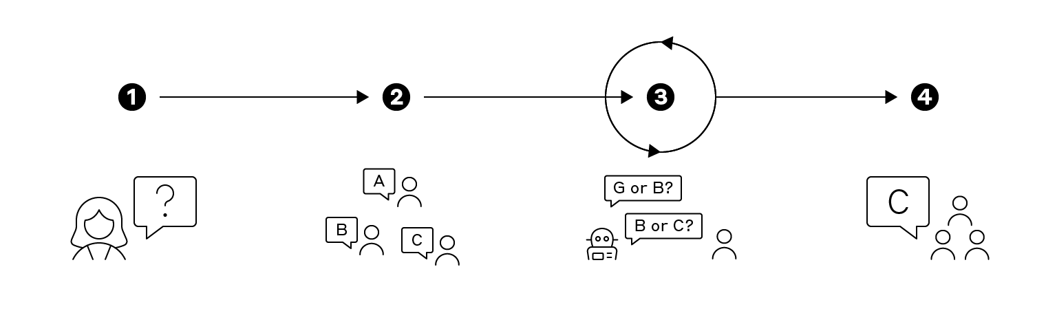
4 Steps of a Conversation
- First, the moderator, e.g. researchers or leaders, asks the group, e.g. target audiences or employees, an open-ended question.
- Each participant in a group is given a chance to suggest an answer.
- Each participant is presented two answers from the group, and is asked to vote for the one that they agree more with. Voting repeats until the answer reaches statistical significance. It usually requires 10 rounds.
- The moderator receives the most statistically significant answer from the group.
Use Cases and Personas
Remesh was still exploring use cases at this nascent stage. Their business development found the following use cases:
Employee Feedback
Company Leaders as Moderators
- Goals: Understand what their employees think on a company matter.
- Behaviors: Have limited time and capacity engaging with employees, especially for large companies.
- Frustrations: Surveys and feedback forms are inadequate.
Company Employees as Participants
- Goals: Express their needs and concerns with their employer, like a town hall.
- Behaviors: Communications to seniors are rare. Chat mostly within in-groups.
- Frustrations: Have limited communication channels. Voices drowned out by vocal employees.
Customer Research
Customer Researchers as Moderators
- Goals: Understand the needs and motivations of their users. Collect user stories and synthesize them into insights.
- Behaviors: Speak to customers often. Create research reports with findings and insights.
- Frustrations: Traditional customer research methods are tedious. Hard to find a balance between qualitative and quantitative.
Target Audiences as Participants
- Goals: Express their needs and opinions on a product that they rely on or are loyal to.
- Behaviors: Word of mouth. Post online reviews. Reply to surveys sometimes.
- Frustrations: Their opinions are not being heard.
Step 2
Auditing the User Experience
While the prototype was functional for the team, they realized that new users were confused by it.
To understand the sources of confusion, I shadowed new users and observed what they were stuck at, during our weekly user tests with other companies at the accelerator.
I concluded that there are 3 main issues to look into:
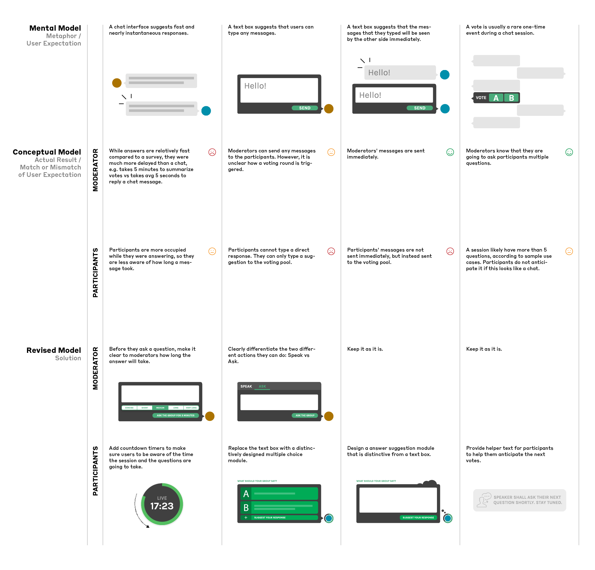
Affordance
"What's going on? Why can't I respond?"
There were no precedents to follow, so the team picked a chat UI. However, the conceptual model of the chat UI did not match the mental model of what a user expected from a chat UI.
Trust
"Why is this the answer? Why should I trust that it represents the group?"
When the A.I. deduced an answer that most of the group did not agree, they did not trust it to represent their collective voice.
Time & Engagement
"This is taking too long."
Sessions ran over-time and participants dropped off. Each question took too much time. Users did not know when to expect the next questions.
1
Providing Affordance
The original prototype used a chat screen as the metaphor of a session. While it worked as a sales pitch to suggest ease of use and efficiency like other A.I. chatbots of the time, it was not a perfect match between the actual product and user expectations.
My first instinct was to question whether a chat interface was an appropriate metaphor at all to start with, but we decided against looking for alternatives due to time constraints.
Instead, I looked into the problems of chat interface in detail:
2
Delivering Trust
Moderators and participants had different concerns about their confidence with the final answer.
Moderators
- Unfamiliarity: This was a new research method. They wanted to understand how the A.I. arrived at the group answer.
- Lack of data points: They needed data to back their findings. And they needed data to figure out what to ask next.
Participants
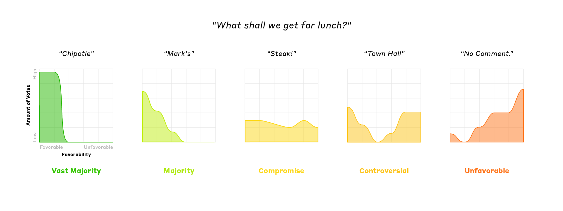
- Lack of representation:When the answer represented the vast majority group, the A.I. felt like magic - "It just works!" However, while participants with most answers chosen felt represented or heard, those with answers not chosen felt unheard.
- Misleading results: It turned out that highest score did not necessarily mean the best answer. When a group did not have a majority answer, a compromise or a controversial answer had the highest score instead.
We looked into a few ways to deliver trust: branding and explaining the data. Most feedback pointed to the latter. By explaining how the A.I. arrived at the answer, we gave users more confidence in the answer.
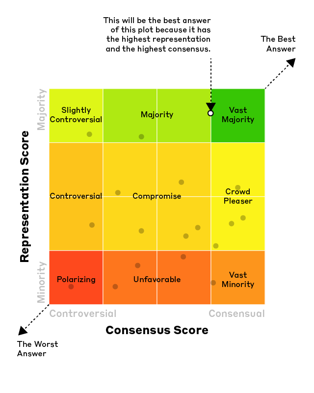
Showing the votes behind each answer revealed that answers vary in terms of representation and consensus of the group:
Distribution of Answers
By plotting each answer according to its representation and consensus scores, we were able to provide a clearer and more nuanced picture of what the group thought about.
Simplified Visualization
I simplified the UI for the participants who did not need access to data visualizations. We simply labeled each answer and let users know how much it represents the entire group.

3
Maximizing Time and Engagement
The longer time it took to arrive at an answer, the more accurate the answers would be, but the less patience the users would have since real-time sessions required constant engagement for the entire period of time.
Unlike a casual chat that could happen at any time, a Remesh session was closer to a meeting appointment that required scheduling to get together a large group to participate.
Since time was limited in this use case, we needed to best understand how time was used in a session and how we could keep the users engaged:

Question Duration Feature
While we learned that more controversial questions take a longer time to answer and follow-up questions take a shorter time, we did not have a way to anticipate it.
So instead we gave moderators choices for how long and how accurate each question they wanted the answers to be:
- 30 Seconds and 1 Minute: Perfect for questions where you want participants to choose from a small set of options.
- 2 Minutes: Tends to be a good fit for most questions, with plenty of time for short responses
- 4 Minutes: Questions requiring a little bit of additional thought or a lengthier response.
- 15 Minutes: If you are using Remesh with a large group on social media, at a conference, or are looking for a longer response.

Countdown Timers
And I designed a countdown timer with multiple states for both moderators and participants to make sure that users are engaged and the sessions ran on time.

Step 3
Putting Them All Together
Taking account of all the insights and ideas from my design research and explorations, I revamped the user experience by mapping the entire chat process to manage the wireframes that need to be designed.

Wireflow of the Chat Sequence
Prototype of Mobile Client
Prototype of Web Client
A Happy Ending
Soon after the conclusion of the accelerator, Remesh landed their first contract.
Remesh is now a successful startup on its Series A round with $38M+ raised.
"Madelena's ability to incorporate intricate details while maintaining a broad focus, all driven by the archetypal user journey, to create a clean and aesthetically pleasing design is impressive - that coupled with her work ethic and efficiency made her an ideal UX/UI designer for Remesh as we sprinted to get our beta product out on a tight timeline."
Skills Applied
- UX Audit
- Service Diagram
- Wireflow
- Prototyping
Team
- Andrew K.
CEO - Charbel C.
CTO - Gary E.
COO - Charlie H.
Software Engineer - Didi V.
Designer (Brand) - Ali C.
Designer (Deck) - Me
Lead Designer (UX)